


When you first started learning how to code, one of the most common clichés you heard was, “Don’t reinvent the wheel.” This is the same case in web development, and there’s no need to start from scratch every time you build a website or web application.
Web applications are the gateway to success for your product or service, and in today’s digital era, providing a seamless user experience is crucial. Users expect your web application to load quickly and have a visually appealing user interface. According to Taylor & Francis Online, the average users form an opinion of a business/product within 0.05 seconds of viewing the website. A good user interface layout, design, and web experience are essential.
JavaScript has become an integral part of every aspect of web development, powering the dynamic and interactive experiences that users expect. Regarding building complex and interactive user interfaces, React, a JavaScript library, has become one of the most popular and widely used JavaScript libraries.
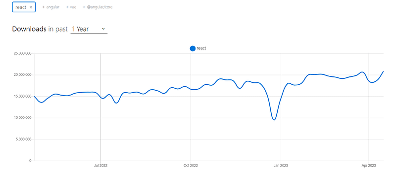
With over 19.5 million weekly downloads, React has proven a reliable and efficient tool for building complex and interactive user interfaces.
The popularity of React has led to the creation of many UI libraries and component frameworks, each with its advantages and features. With these best CSS frameworks for React, developers can easily include pre-built, tested UI components in their projects by building on top of React’s core functionality. It helps to maintain the project in the long run and saves developers time and effort, allowing them to focus on the unique features of their application.
In this detailed blog, we have jotted down the 23 best CSS frameworks for React to create high-quality applications in 2023, exploring features, advantages, and use cases.
Without ado, let’s get started with the best CSS frameworks for React.
Inspect web elements to help developers and testers to debug UI flaws or make modifications in HTML or CSS files. Learn how to inspect on MacBook.
Quick Recap of React
React is a popular open-source front-end JavaScript library that can be used to build user interfaces (UIs). Facebook developed it and has gained popularity for its efficient and reusable components.
React allows developers to build complex UIs by breaking them down into smaller, reusable components. These components can be used across different parts of an application, which reduces the amount of code that needs to be written and maintained.
React uses a declarative approach to programming, meaning developers only need to describe what they want the UI to look like, and React takes care of the underlying logic to make it happen. React also has a virtual DOM, which helps to improve performance by only updating the parts of the UI that have changed rather than the entire UI.
According to the State of JS Survey 2022, React is the most popular frontend library, with approximately 17.4 million weekly downloads. It is widely used in the industry and has been adopted by many Fortune 500 companies, including Facebook, Instagram, Airbnb, Netflix, and Dropbox.
With its plethora of libraries, components, and extensions, it provides a complete and extensive solution for developing React-based web applications. The component-based architecture of React lets developers break up a user interface into smaller, reusable parts. This makes it easier to build and maintain large applications.
React can create various applications, including web, mobile, and desktop applications. It is often used with other libraries and frameworks like Redux, React Native, and Next.js.
Many production-grade frameworks, such as Next, are built on React. These frameworks help to extend the capabilities of React and provide additional features and functionality that can make building web applications more accessible and more efficient.
This article explains the emulator vs simulator vs real device differences, the learning of which can help you select the right mobile testing solution for your business.
What are React-based CSS Frameworks and Component Libraries?
CSS frameworks for React and Component libraries are the foundations of React-based applications. They provide pre-built user interface components that can be easily integrated into the application, saving developers time and effort in creating these components from scratch.
Both the React UI framework and a component library provide UI components, but they differ in their scope and level of customization.
Some best CSS frameworks for React include Material-UI, React Bootstrap, Semantic UI React, Ant Design, Blueprint, and many more. These frameworks provide a wide range of customizable, pre-built UI components and libraries that can be used to build beautiful and responsive user interfaces.
Here are some differences between CSS frameworks for React and their component libraries based on some key factors:
Scope
CSS frameworks for React offer a set of ready-made UI components, such as navigation menus, layouts, responsive templates, and more, which are integral to building modern-day websites. With the help of these best CSS frameworks for React, front-end developers can save time and effort by using pre-built components already optimized for performance and accessibility while still being customizable to suit their needs. Some popular UI frameworks include Material UI, Ant design, etc.
On the other hand, React component libraries are more specific; they provide individual, reusable components, such as buttons, inputs, and icons, that can be combined and customized to create more complex UIs. Some of the popular component libraries include React Bootstrap, Chakra UI, etc.
Adaptability
CSS frameworks for React are less customizable and have several restrictions, limiting the developer’s ability to create a unique UI design. This set of best CSS frameworks for React has its design patterns and rules that must be followed to keep the application consistent.
On the other hand, React component libraries are more developer friendly and customizable compared to UI frameworks. Unlike UI frameworks, we can easily customize the designs that match the design of your project, and you don’t need to override the styles used in UI frameworks.
Learning Curve
CSS frameworks for React are difficult to grasp because they have design patterns, constraints, and conventions that must be followed to ensure consistency throughout the application. But once you become familiar with this set of best CSS frameworks for React, it is just a piece of cake 🙂
On the other hand, React component libraries are generally considered easier to use than CSS frameworks for React, as they often have a lower learning curve. Component libraries do not require you to follow a specific set of design patterns and conventions, which gives you greater flexibility and control over the design and functionality of your UI.
Accessibility
CSS frameworks for React and component libraries can help make your application more accessible to all users. Many of these libraries already include accessibility features, so you don’t have to worry about adding them yourself. This means that people with special abilities can still easily use your application.
On the other hand, choosing between various lists of best CSS frameworks for React and component libraries depends on what you need for your project and what you prefer. If you want a lot of pre-made components and a consistent UI design, go for a framework. But if you want more control and customization options, go for a component library.
In the next section, we’ll look at some best CSS frameworks for React you can use in web designs.
Need a great solution for cross browser testing on Safari? Forget about emulators or simulators — use real online browsers. Try LambdaTest to test on safari browser online.
23 Best CSS Frameworks for React to Use in 2023
Choosing the right one among various best CSS frameworks for React and component libraries for your application can be daunting. Still, there are plenty of options available to help simplify the process. In this blog, we’ve compiled a list of the 23 best CSS frameworks for React and their libraries that are popular among developers for their usability and accessibility.
So, let’s dive in and explore the best CSS frameworks for React and component libraries available for your next project.
Material UI
Material UI is the React implementation of the well-known design language Material Design. Google developed Material Design to provide a united, consistent, real-life-like design experience for all its products and services.
It provides a material design touch to React-based applications. Material UI provides several pre-built UI components like buttons, forms, grid systems, navigation tabs, etc., making it one of the best CSS frameworks for React. Material-UI has garnered a lot of positive feedback and popularity within the developer community.
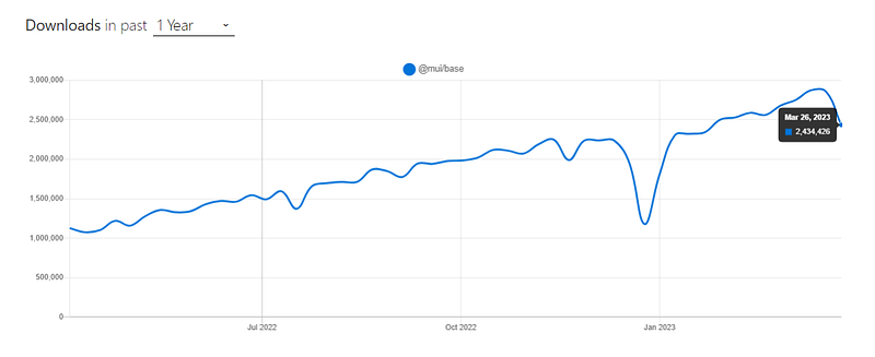
Material UI has around 2.8 million weekly downloads, according to NPM trends.
At the time of writing this blog on best CSS frameworks for React, Material UI has around 85.4K+ stars and 29.4K+ forks on GitHub, which shows its popularity. The best thing about Material UI is that their documentation is well-written, and we can follow along without hassle.
Installation
npm:
npm install @mui/material @emotion/react @emotion/styled
Yarn:
yarn add @mui/material @emotion/react @emotion/styled
Let’s consider taking an example for better understanding.
import React from "react";
import { Card, CardMedia, CardContent, Typography } from "@mui/material";
import { Box } from "@mui/system";


const App = () => {
  return (
    <Box>
      <Card sx={{ maxWidth: 500, padding: 5, margin: 2 }}>
        <CardMedia
          component="img"
          height="200"
          image="https://www.lambdatest.com/blog/wp-content/uploads/2020/08/LambdaTest-320-180.png"
          alt="LambdaTest"
          sx={{
            "@media screen and (max-width: 600px)": {
              height: "150px",
            },
          }}
        />
        <CardContent
          sx={{
            "@media screen and (max-width: 600px)": {
              paddingBottom: "20px",
            },
          }}
        >
          <Typography gutterBottom variant="h5" component="div">
            LambdaTest{" "}
          </Typography>
          <Typography variant="body2" color="text.secondary">
            Lambdatest is a cloud-based testing platform that allows developers
            and testers to perform cross-browser testing of web applications. It
            provides a virtual environment to test applications on a range of
            browsers, operating systems, and devices.
          </Typography>
        </CardContent>
      </Card>
    </Box>
  );
};


export default App;
Output:

Pros:
Well-documented API: Has the best documentation available, which makes it easy to use and understand.
Consistency: Offers a consistent design and style across all the components like buttons, cards, etc., which helps you to maintain a uniform look and feel across a variety of devices, including desktops, tablets, and mobile devices.
Customization: Provides different ways to customize it, so you can change the pre-built parts to fit your needs. It is available for both TypeScript and JavaScript, allowing you to choose the best language for your project.
Cons:
Large bundle size: Provides some additional code support to your application, which can result in a larger bundle size and slower loading times.
Lack of Flexibility: Offers specific design language and style, which limits developers’ ability to create unique UI designs.
Learning Curve: Time-consuming, especially if you are new to React.
As of writing this blog on the best CSS frameworks for React, the latest stable version of Material UI is v6.2.0.
Test your native, hybrid, and web apps across all legacy and latest mobile operating systems on the most powerful online emulator Android.
Ant Design
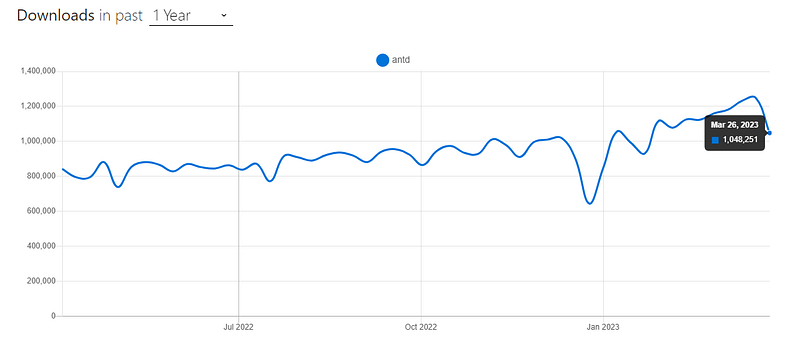
Ant Design proclaimed itself as the second most popular among various best CSS frameworks for React, and they are right about that. It has been widely used, and according to npm trends, it has around 1.2 million downloads per week.
Ant Design is like Material UI, providing several UI components that look aesthetic and clean. Ant Design is based on the design language Ant Design, which has its design patterns and principles, making it one of the best CSS frameworks for React.
When writing this blog on the best CSS frameworks for React, Ant Design had around 85.1K+ stars and 38.6K+ forks, which shows its popularity among developers. It has about 1900 contributors, and the library is actively maintained.
Installation
npm:
npm install antd
Yarn:
yarn add antd
Let’s consider by taking an example for better understanding.
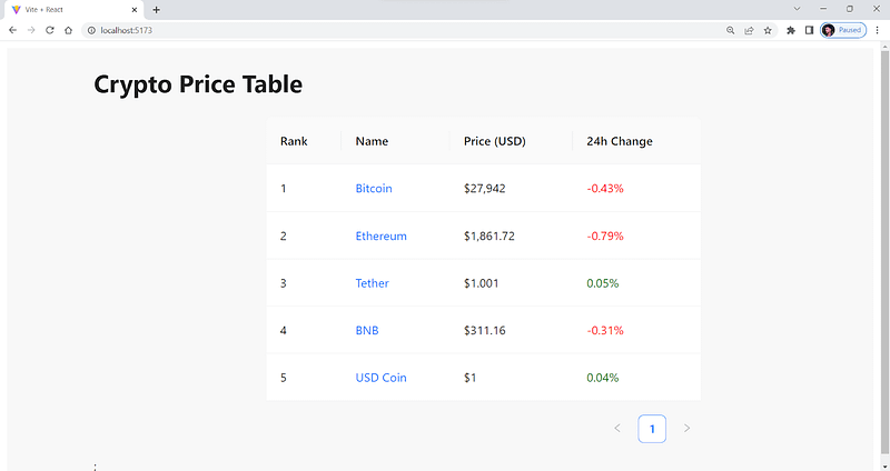
import React, { useEffect, useState } from "react";
import { Table } from "antd";


const columns = [
  {
    title: "Rank",
    dataIndex: "rank",
    key: "rank",
  },
  {
    title: "Name",
    dataIndex: "name",
    key: "name",
    render: (text, record) => (
      <a
        href={`https://www.coingecko.com/en/coins/${record.id}`}
        target="_blank"
        rel="noopener noreferrer"
      >
        {text}
      </a>
    ),
  },
  {
    title: "Price (USD)",
    dataIndex: "price",
    key: "price",
  },
  {
    title: "24h Change",
    dataIndex: "change",
    key: "change",
    render: (text, record) => {
      const color = record.change > 0 ? "green" : "red";
      return <span style={{ color }}>{`${record.change}%`}</span>;
    },
  },
];


const CryptoTable = () => {
  const [dataSource, setDataSource] = useState([]);


  useEffect(() => {
    const fetchTopCryptos = async () => {
      try {
        const response = await fetch(
          "https://cors-anywhere.herokuapp.com/https://api.coingecko.com/api/v3/coins/markets?vs_currency=usd&order=market_cap_desc&per_page=5&page=1&sparkline=false"
        );
        const data = await response.json();
        const formattedData = data.map((crypto, index) => ({
          key: crypto.id,
          rank: index + 1,
          name: crypto.name,
          price: `$${crypto.current_price.toLocaleString()}`,
          change: parseFloat(crypto.price_change_percentage_24h).toFixed(2),
          id: crypto.id,
        }));
        setDataSource(formattedData);
      } catch (error) {
        console.error(error);
      }
    };
    fetchTopCryptos();
  }, []);


  return (
    <div style={{ overflowX: "auto", marginLeft: 100 }}>
      <h1>Crypto Price Table</h1>
      <Table
        columns={columns}
        dataSource={dataSource}
        style={{ width: 500, margin: "auto" }}
      />
      ;
    </div>
  );
};


export default CryptoTable;
Output:
Pros:
Well-documented: It is well-documented, and it is easy to understand even if you are trying it for the first time.
Active development: Under active development and receives regular updates to keep up with the latest web technologies and elements.
Good performance: Minimal design and high-performance components, resulting in fast and responsive applications.
Cons:
Over-Engineering: Provides a lot of out-of-the-box functionality, which can lead to over-engineering or using unnecessary features. This can result in code that is more complex and harder to maintain. For example, If you’re making a simple form using Antd’s Form component, you may not need all of its predefined features, such as validation rules and layout options.
Design limitations: Its components follow a specific visual design, which may not be suitable for all applications. There may be limitations to the framework for developers who require more flexibility in their design.
When writing this blog on the best CSS frameworks for React, the latest version of Ant Design is v5.4.3, and the developers are continuously working on it to improve the performance and overall efficiency of the library.
Test your native, hybrid, and web apps across all legacy and latest mobile operating systems on the most powerful online Android emulator.
React Bootstrap
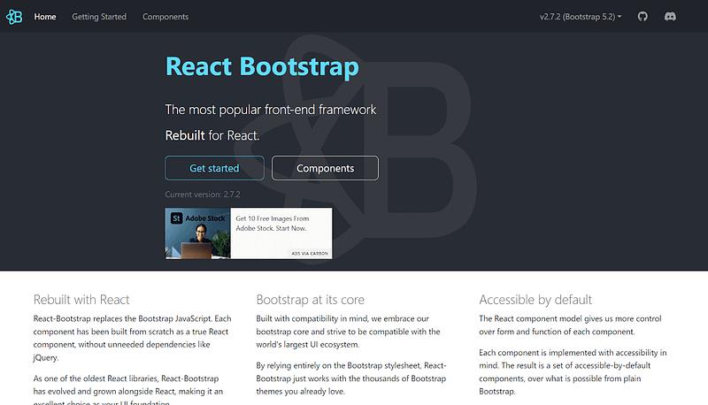
If you’re in the world of web development, or more specifically, if you’re into front-end development, you may already be familiar with Bootstrap. Bootstrap is another popular and one of the best CSS frameworks for React from the list that provides a collection of reusable UI components and styles that can be used in any web application.
React-Bootstrap is built on top of the Bootstrap CSS framework. It provides a set of React components based on the Bootstrap CSS framework, making it easier for developers to build React-based responsive and mobile-first design web applications.
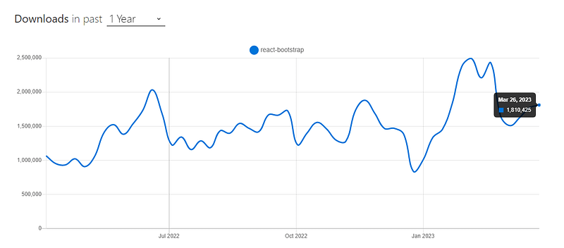
According to npm, React Bootstrap has around 1.7 million weekly downloads, which shows the library’s popularity.
Source
Installation
npm:
npm install react-bootstrap bootstrap
Yarn:
yarn add react-bootstrap bootstrap
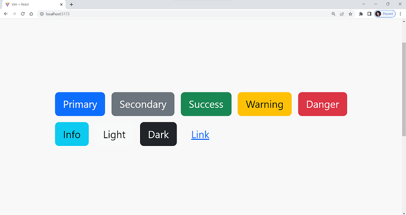
Let’s consider taking an example for better understanding.
import Button from "react-bootstrap/Button";
import 'bootstrap/dist/css/bootstrap.min.css';


function App() {
  return (
    <div style={{width:"100vh",margin:"auto",marginTop:250, }}>
      <Button variant="primary" style={{margin:5}}>Primary</Button>
      <Button variant="secondary" style={{margin:5}}>Secondary</Button>
      <Button variant="success" style={{margin:5}}>Success</Button>
      <Button variant="warning" style={{margin:5}}>Warning</Button>
      <Button variant="danger" style={{margin:5}}>Danger</Button>
      <Button variant="info" style={{margin:5}}>Info</Button>
      <Button variant="light" style={{margin:5}}>Light</Button>
      <Button variant="dark" style={{margin:5}}>Dark</Button>
      <Button variant="link" style={{margin:5}}>Link</Button>
    </div>
  );
}


export default App;
Output:
Pros:
Extensive component library: Offers a large set of UI elements ranging from buttons to interactive form elements.
Highly responsive: It is designed to be highly responsive and provides several built-in methods for various device dimensions.
Easy integration: Easily integrated with React, and everything is straightforward.
Cons:
Additional dependencies: To make the components interactive, React-Bootstrap requires additional dependencies to be added to the application, which may increase the overall complexity of the application.
Incompatibility with older browsers: Some React-Bootstrap components may not be compatible with older browsers, limiting the application’s reach.
Potential conflicts with other libraries: React-Bootstrap may conflict with other JavaScript libraries used in the application, resulting in errors or unexpected behavior.
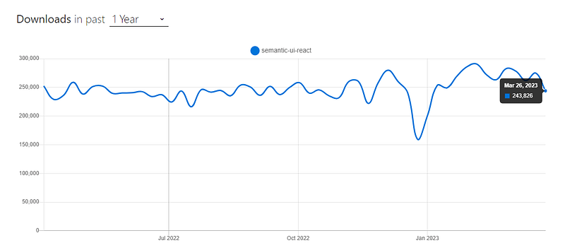
Semantic UI React
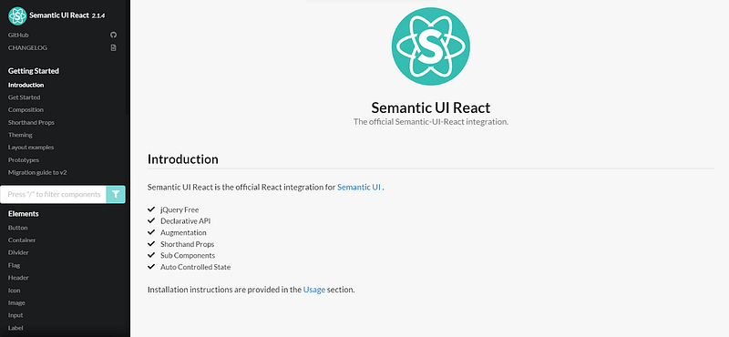
You may have heard of or even used Semantic UI before. Semantic UI React is an easy-to-use, highly customizable, and of the best CSS frameworks for React, offering reusable UI components and styles.
Semantic UI React is built on top of Semantic UI, and it is one of the popular libraries that provides reusable React components that are highly customizable. According to npm trends, Semantic UI React garners around 250,000+ weekly downloads.
In this article, we take a look at some aspects of simulation and discuss some ways through which we can use ios emulator for pc.
Source
At the time of writing this blog on the best CSS frameworks for React, Semantic UI React has around 14K+ stars and 4K+ forks on GitHub, with around 330 contributors. Also, the current stable version is v2.1.4, and the project is actively maintained.
Installation
npm:
npm install semantic-ui-react semantic-ui-css
Yarn:
yarn add semantic-ui-react semantic-ui-css
After installation, import the minified CSS file in your app’s entry file:
import 'semantic-ui-css/semantic.min.css'
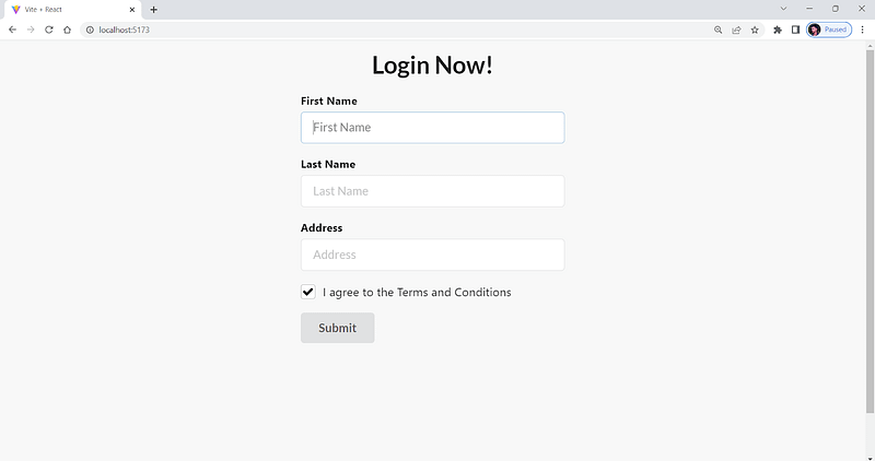
Let’s consider taking an example for better understanding.
import React, { useEffect, useState } from "react";
import { Button, Checkbox, Form } from "semantic-ui-react";
import "semantic-ui-css/semantic.min.css";


// simple form using semantic ui react


const App = () => {
  return (
    <div style={{width:"70%",margin:"auto",marginTop:100}}>
<h1 style={{textAlign:"center"}}>Login Now!</h1>
    <Form>
      <Form.Field>
        <label>First Name</label>
        <input placeholder="First Name" />
      </Form.Field>
      <Form.Field>
        <label>Last Name</label>
        <input placeholder="Last Name" />
      </Form.Field>


      {/* address */}
      <Form.Field>
        <label>Address</label>
        <input placeholder="Address" />
      </Form.Field>


      <Form.Field>
        <Checkbox label="I agree to the Terms and Conditions" />
      </Form.Field>
      <Button type="submit">Submit</Button>
    </Form>
    </div>
  );
};


export default App;
Output:
Pros:
Theming support: Its component allows developers to customize the color scheme and other visual aspects easily.
Accessibility: Designed to be accessible with keyboard navigation and ARIA roles and other accessibility features are integrated. Still, there are some concerns about the HTML Semantic tags and markups of Semantic UI.
Minimal: Semantic UI React is minimal compared to other libraries, and it is easy to start with it.
Cons:
Limited documentation: Compared to other libraries, it has limited documentation. It can bring a lot of hassle for someone starting to work with Semantic UI React for the first time.
Smaller community: Compared to other libraries like Material UI and Ant Design, which have over 500K users, Semantic UI React has a smaller community of developers.
In this tutorial, learn what is Regression testing, its importance, types, and how to perform it.
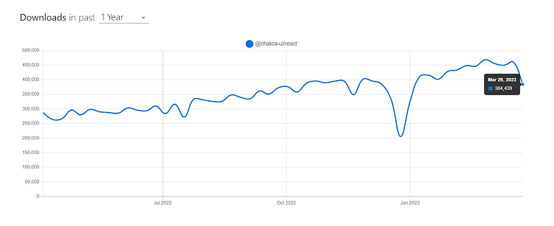
Chakra UI
Chakra UI is a well-known and among the best CSS frameworks for React, which is known for its simplicity, modularity, and usability. It provides developers with a set of reusable components that can be easily combined and customized to create responsive and mobile-first web applications.
According to npm trends, Chakra UI has around 460,000 weekly downloads, around 31.8K+ stars, and 2.8K+ forks on GitHub.
Source
Chakra UI has a set of simple, composable components that can be easily combined to make more complex components and layouts. As of writing this blog on the best CSS frameworks for React, the latest stable version of Chakra UI is v2.5.5.
Installation
npm:
npm i @chakra-ui/react @emotion/react @emotion/styled framer-motion
Yarn:
yarn add @chakra-ui/react @emotion/react @emotion/styled framer-motion
Let’s consider taking an example for a better understanding.
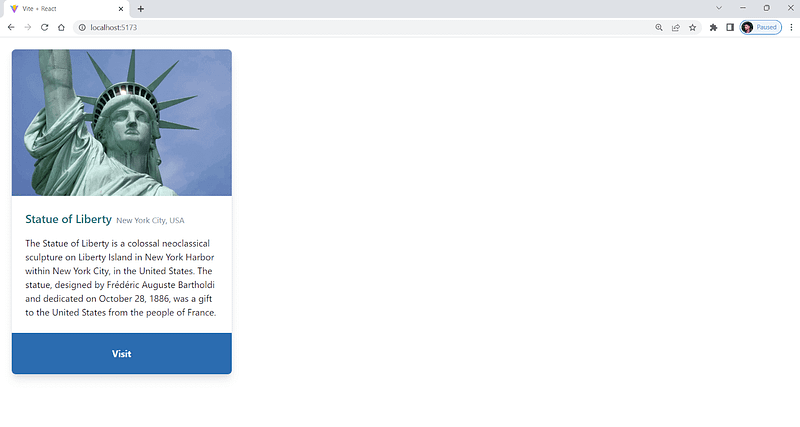
import { Box, Flex, Image, Text } from "@chakra-ui/react";


const StatueOfLibertyCard = () => {
  return (
    <Box
      maxW="sm"
      borderWidth="1px"
      borderRadius="lg"
      overflow="hidden"
      boxShadow="lg"
      margin={5}
    >
      <Image
        src="https://cdn.britannica.com/82/183382-050-D832EC3A/Detail-head-crown-Statue-of-Liberty-New.jpg"
        alt="Statue of Liberty"
      />
      <Box p="6">
        <Flex alignItems="baseline">
          <Text fontSize="xl" fontWeight="semibold" color="teal.600" mr={2}>
            Statue of Liberty
          </Text>
          <Text fontSize="sm" color="gray.500">
            New York City, USA
          </Text>
        </Flex>


        <Text mt={4}>
          The Statue of Liberty is a colossal neoclassical sculpture on Liberty
          Island in New York Harbor within New York City, in the United States.
          The statue, designed by Frédéric Auguste Bartholdi and dedicated on
          October 28, 1886, was a gift to the United States from the people of
          France.
        </Text>
      </Box>
      <Box
        p="6"
        display="flex"
        justifyContent="center"
  alignItems="center"
        bg="blue.600"
      >
        <Text color="white" fontWeight="bold">
          Visit
        </Text>
      </Box>
    </Box>
  );
};


export default StatueOfLibertyCard;
Output:
Pros:
Easy to learn: Simple and easy to use for both beginners and experienced developers.
Color mode: Provides built-in support for switching between dark and color modes.
Highly customizable: Offers a wide range of customizable and accessible components, all with consistent design patterns.
Cons:
Limited UI elements: Comparatively new library with limited UI elements.
Higher level of integration: Unlike other libraries, Chakra UI needs a context setup. We must wrap our main App.jsx component within < ChakraProvider >, which adds some overhead.
Blueprint UI
Blueprint is one of the best CSS frameworks for React. Blueprint provides several reusable components, like icons, calendars, tables, etc., which you can use to make your React application.
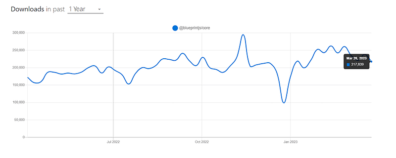
According to npm trends, Blueprint has around 240,000 weekly downloads and a steadily growing user base. This popularity is due to its comprehensive and well-designed set of UI components, as well as its ease of use and customization.
At the time of writing this blog on best CSS frameworks for React, Blueprint has around 20K+ stars and 2.1K+ forks on GitHub.
Installation
npm:
npm install @blueprintjs/core
Yarn:
yarn add @blueprintjs/core
Let’s consider taking an example for better understanding.
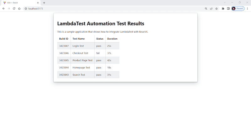
import React from "react";
import { Card, Elevation, HTMLTable } from "@blueprintjs/core";
import "@blueprintjs/icons/lib/css/blueprint-icons.css";
import "@blueprintjs/core/lib/css/blueprint.css";


const App = () => {
  const testData = [
    {
      build_id: "3423847",
      test_name: "Login Test",
      status: "pass",
      duration: "25s",
    },
    {
      build_id: "3423846",
      test_name: "Checkout Test",
      status: "fail",
      duration: "37s",
    },
    {
      build_id: "3423845",
      test_name: "Product Page Test",
      status: "pass",
      duration: "42s",
    },
    {
      build_id: "3423844",
      test_name: "Homepage Test",
      status: "pass",
      duration: "18s",
    },
    {
      build_id: "3423843",
      test_name: "Search Test",
      status: "pass",
      duration: "31s",
    },
  ];


  return (
    <Card
      elevation={Elevation.THREE}
      style={{ width: "100%", maxWidth: "800px", margin: "0 auto" }}
    >
      <h1>LambdaTest Automation Test Results</h1>
      <p>
        This is a sample application that shows how to integrate LambdaTest with
        ReactJS.
      </p>
      <HTMLTable bordered={true} striped={true} responsive={true}>
        <thead>
          <tr>
            <th>Build ID</th>
            <th>Test Name</th>
            <th>Status</th>
            <th>Duration</th>
          </tr>
        </thead>
        <tbody>
          {testData.map((test, index) => (
            <tr key={test.build_id}>
              <td>{test.build_id}</td>
              <td>{test.test_name}</td>
              <td>{test.status}</td>
              <td>{test.duration}</td>
            </tr>
          ))}
        </tbody>
      </HTMLTable>
    </Card>
  );
};


export default App;
Output:
Pros:
Well-Maintained: Well-maintained library, and the developers add new features with each release.
Well documented: Well-documented, and it helps developers quickly get up to speed with its usage.
Customizable: Offers a variety of customizable, high-quality UI components for React.
Cons:
Learning curve: Steep learning curve, making it challenging for beginners to use.
Lacks theming option: Lacks extensive theming options, limiting the ability to customize the UI to match brand guidelines.
Smaller community: Has a smaller community of developers contributing (349 contributors) to the project compared to some other established UI libraries like Material UI.
Perform browser automation testing on the most powerful cloud infrastructure. Leverage Your Test automation for faster, reliable and scalable experience on cloud.
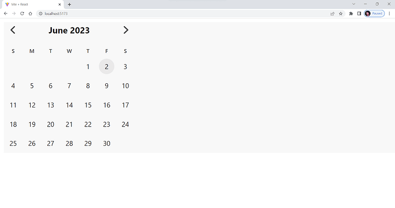
Mantine
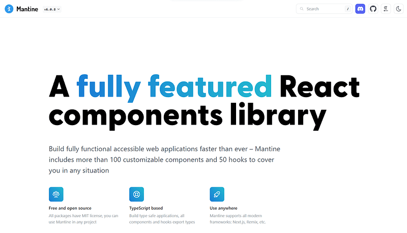
Mantine is an easy-to-use, highly customizable, and one of the popular CSS frameworks for React that provide developers with a variety of reusable components and utilities for creating modern web applications. Its range of features and components includes forms, modals, navigation elements, and much more, making it one of the best CSS frameworks for React available today.
Mantine has over 100+ customizable components and 40 hooks, allowing developers to easily create beautiful, responsive, and highly-functional user interfaces for their web applications.
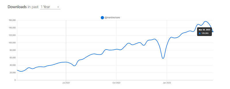
According to npm trends, it has around 150,000 weekly downloads and is widely used. The fact that its download numbers have been steadily increasing over the past few months suggests that its popularity is growing.
Source
Let’s consider taking an example for a better understanding.
import { Group } from "@mantine/core";
import { Calendar } from "@mantine/dates";
import * as React from "react";


const App = () => {
  const currentDate = new Date();


  const handleDateChange = (date) => {
    console.log("Selected Date:", date);
  };


  const calendarStyle = {
    background: "whitesmoke",
    border: "1px solid gray",
    borderRadius: "4px",
    boxShadow: "0 0 4px 2px rgba(0, 0, 0, 0.1)",
    width: "100%",
    maxWidth: "500px",
    height: "500px",
    display: "flex",
    flexDirection: "column",
    justifyContent: "center",
    alignItems: "center",
    fontSize: "1.2rem",
    fontWeight: "bold",
    color: "gray",
    cursor: "pointer",
    transition: "all 0.2s ease-in-out",
  };


  return (
    <Group position="center">
      <Calendar
        style={calendarStyle}
        defaultMonth={currentDate}
        onMonthChange={(date) => console.log("Month Changed:", date)}
        onDateSelected={handleDateChange}
      />
    </Group>
  );
};


export default App;
Output:
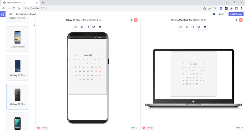
The above output is rendered on LT Browser 2.0 — a dev-friendly Chromium-based browser with over 50+ pre-installed viewports with multiple standard resolutions to perform responsive testing on your websites and web applications.
Pros:
Easy to Use: It is easy to use and can be changed in many ways. It has a lot of reusable components and tools for building modern web apps.
High-Quality Components: Offers a wide range of high-quality components that can be used to make applications that are responsive and easy to use.
Well documented: Its clear and crisp documentation makes it easy for developers to understand and use its components, even if they are new to the library or React development.
Cons:
Limited Third-party Support: Relatively new library, so it may not have as many third-party plugins or extensions available compared to more established libraries.
Learning Curve: While Mantine has good documentation, it may still require some time for developers to get familiar with its API, components, and features.
Rebass
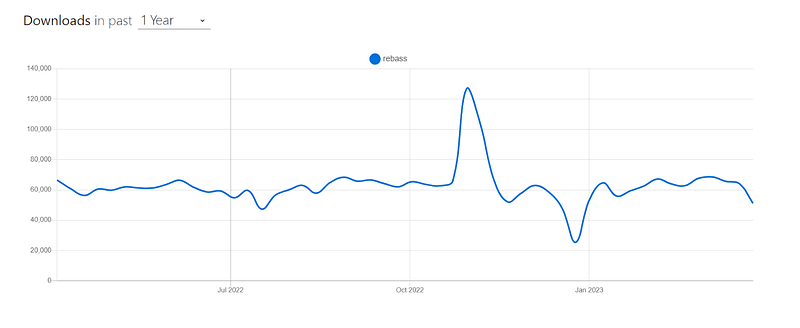
Rebass is a primitive UI component library among various popular and best CSS frameworks for React. It provides a set of low-level, simple, and reusable building blocks for creating user interfaces in React. The Styled System library is used to build Rebass components. It has an API for changing styles and responsive behaviors based on themes.
According to npm trends, it has around 65,000 weekly downloads, and recently it has gained popularity among React developers for its simplicity and ease of use.
Source
Installation
npm:
npm install rebass
Yarn:
Yarn add rebass
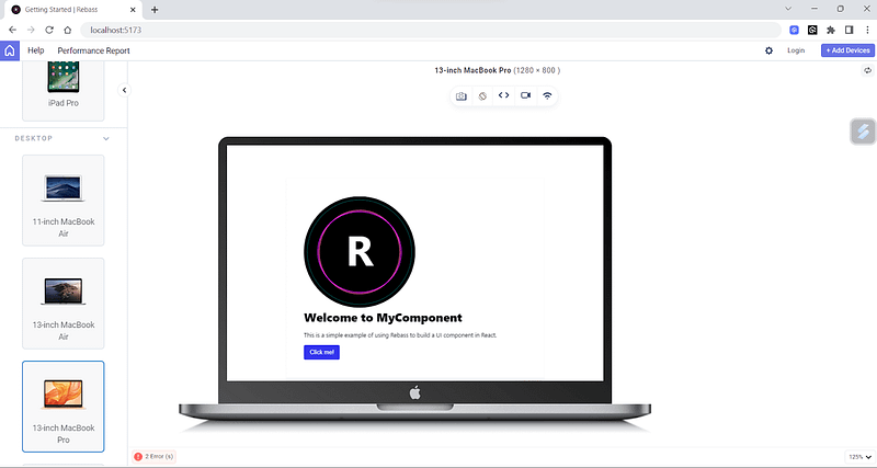
Let’s consider by taking an example for better understanding.
import React from "react";
import { Box, Heading, Text, Button } from "rebass";


function App() {
  return (
    <Box p={4} bg="white" boxShadow="0 0 8px rgba(0, 0, 0, 0.1)">
      <Image
        src={"https://rebassjs.org/logo.svg"}
        sx={{
          width: ["100%", "50%"],
          borderRadius: 8,
        }}
      />
      <Heading fontSize={5} mb={3}>
        Welcome to MyComponent
      </Heading>
      <Text mb={3}>
        This is a simple example of using Rebass to build a UI component in
        React.
      </Text>


      <Button variant="Secondary">Click me!</Button>
    </Box>
  );
}


export default App;
Output:
Pros:
Responsive design: Rebass comes with built-in support for responsive design, making it hassle-free to create mobile-friendly layouts.
Theming: Compatible with CSS-in-JS libraries such as Styled Components and Emotion so that you can customize and theme the appearance of components easily.
Accessibility: Its components are built with accessibility in mind, making it simple to create UIs that people with special abilities can also use.
Cons:
Minimalistic: It cannot be used for creating complex UI.
Limited scope: Provides a few UI elements, and sometimes it can meet your demand, making it not a good choice for larger projects.
Carbon Design System React
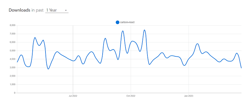
The Carbon Design System is a design language developed by IBM to provide a unified experience across all its products. Carbon Design System React is one of the best CSS frameworks for React, offering a collection of reusable components and styles for developing modern, user-friendly web applications.
According to npm trends, Carbon Design System React has around 100,000 monthly downloads, and it is an actively maintained project.
Installation
npm:
npm install -S @carbon/react
Yarn:
Yarn add @carbon/react
Let’s consider taking an example for better understanding.
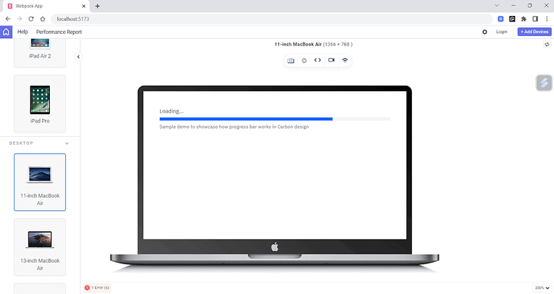
import React from 'react';
import { ProgressIndicator } from 'carbon-components-react';
import 'carbon-components/css/carbon-components.min.css';


const ProgressBar = () => {
  return (
    <div style={{ textAlign: 'center' }}>
      <h2>Loading…</h2>
      <p>Sample demo to showcase how progress bar works in Carbon design</p>}
      <ProgressIndicator />
    </div>
  );
};


export default ProgressBar;
Output:
Pros:
Accessibility: Emphasizes accessibility and offers a wide range of features that make it easy to create applications that are inclusive and accessible to all.
Well-documented: Carbon is well-documented with guidelines, code snippets, and examples to help developers quickly get started with the system.
Cons:
Large bundle size: Carbon’s extensive feature set can result in a large bundle size, which might affect the page load times.
Lack of community contributions: While Carbon has active users, it is primarily maintained by IBM, which may limit community contributions and diversity.
Which are the most wanted tools for automation testing that have climbed the top of the ladder so far? Let’s take a look.
Grommet
Grommet is one of the most known and best CSS frameworks for React that provides accessibility, modularity, responsiveness, and theming support. It is made to be very flexible and easy to change, so developers can make UIs that meet their needs and match their brand.
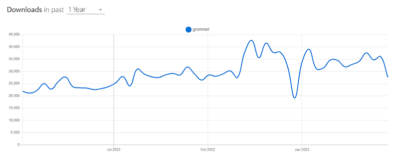
It has around 37,000 weekly downloads, and is becoming popular among developers due to its simplicity.
Installation
npm:
npm install grommet grommet-icons styled-components --save
Yarn:
yarn add grommet grommet-icons styled-components --save
Let’s consider taking an example for better understanding.
import React, { useState } from "react";
import {
  Grommet,
  Box,
  TextInput,
  Button,
  DataTable,
  Layer,
  Text,
} from "grommet";
import { Add, Trash } from "grommet-icons";


const customTheme = {
  global: {
    colors: {
      brand: "#fff0ff",
      accent: "#00ACC1",
    },
  },
  dataTable: {
    header: {
      background: {
        color: "accent",
      },
      font: {
        weight: "bold",
      },
    },
  },
  button: {
    extend: `
      font-weight: bold;
      padding: 12px 24px;
      &:hover {
        background-color: #00796B;
      }
    `,
  },
};


export default function App() {
  const [items, setItems] = useState([]);
  const [name, setName] = useState("");
  const [showConfirm, setShowConfirm] = useState(false);
  const [selectedItem, setSelectedItem] = useState(null);


  const addNewItem = () => {
    setItems([...items, { name }]);
    setName("");
  };


  const removeItem = (item) => {
    const newItems = items.filter((i) => i !== item);
    setItems(newItems);
    setSelectedItem(null);
  };


  return (
    <Grommet theme={customTheme}>
      <Box pad="medium" background="brand" round="medium">
        <Box direction="row" gap="medium">
          <TextInput
            value={name}
            onChange={(e) => setName(e.target.value)}
            placeholder="Enter item name"
            size="small"

          />
          <Button
            icon={<Add />}
            label="Add Item"
            primary
            onClick={addNewItem}
            color="accent"
          />
        </Box>
        <DataTable
          columns={[
            { property: "name", header: "Name", size: "medium" },
            {
              header: "Actions",
              render: (item) => (
                <Button
                  icon={<Trash />}
                  onClick={() => {
                    setSelectedItem(item);
                    setShowConfirm(true);
                  }}
                  color="status-critical"
                />
              ),
              size: "xsmall",
            },
          ]}
          data={items}
          primaryKey="name"
          margin={{ top: "medium" }}
        />
        {showConfirm && (
          <Layer
            onEsc={() => setShowConfirm(false)}
            onClickOutside={() => setShowConfirm(false)}
          >
            <Box pad="medium" gap="medium">
              <Text>
                Are you sure you want to delete "{selectedItem?.name}"?
              </Text>
              <Box direction="row" justify="end" gap="medium">
                <Button label="Cancel" onClick={() => setShowConfirm(false)} />
                <Button
                  label="Delete"
                  color="status-critical"
                  primary
                  onClick={() => {
                    removeItem(selectedItem);
                    setShowConfirm(false);
                  }}
                />
              </Box>
            </Box>
          </Layer>
        )}
      </Box>
    </Grommet>
  );
}
Output:
Pros:
Well-documented: Grommet comes with good documentation and many good examples, making it easy to learn and use.
Theming support: Offers a powerful theming system that allows you to customize the look and feel of your application without modifying the underlying code.
Integration with other frameworks: Supports various frontend frameworks like Angular, Vue, etc.
Cons:
Limited UI elements: Offers limited UI elements; for example, it doesn’t support UI components like calendars or pagination.
Limited Resources: Does not have many resources as other popular UI frameworks such as Bootstrap or Material UI.
Smaller community: Less community support, and because of this, people think twice while choosing it.
Need a great solution for browser testing Safari for Windows? Forget about emulators or simulators — use real online browsers. Try LambdaTest for free.
Fluent UI React

Fluent is a robust, open-source, well-known among various best CSS frameworks for React that helps users create an engaging user experience. Fluent UI is a design system and a set of UI components developed by Microsoft.
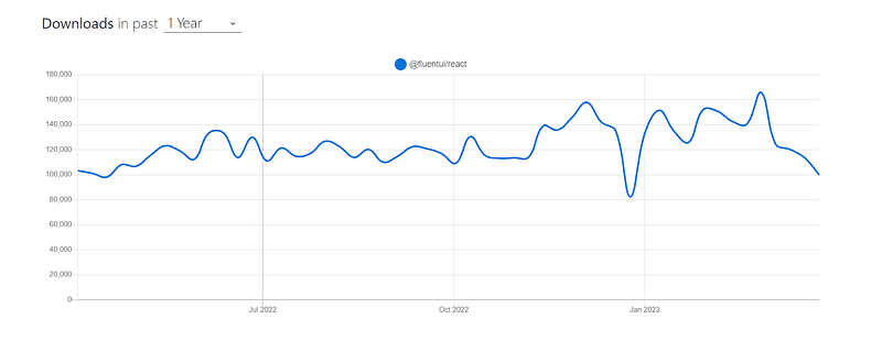
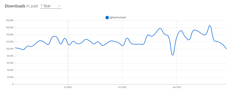
Fluent UI has around 100,000 weekly downloads and is an actively maintained project. As of writing this blog on the best CSS frameworks for React, the current stable version is v9.19.0.
Installation
npm:
npm install @fluentui/react-components
Yarn:
yarn add @fluentui/react-components
Let’s consider taking an example for better understanding.
import * as React from "react";
import {
Stack,
ChoiceGroup,
DefaultButton,
Icon,
MessageBar,
MessageBarType,
Persona,
PersonaSize,
Text,
} from "@fluentui/react";
import { Switch } from "@fluentui/react-components";
const App = () => {
const [isChecked, setIsChecked] = React.useState(false);
const [selectedOption, setSelectedOption] = React.useState("option1");
const [showMessageBar, setShowMessageBar] = React.useState(false);
const handleCheckedChange = React.useCallback((ev, checked) => {
setIsChecked(checked);
}, []);
const handleOptionChanged = (event, option) => {
setSelectedOption(option.key);
};
const handleShowMessageBarClicked = () => {
setShowMessageBar(!showMessageBar);
};
return (
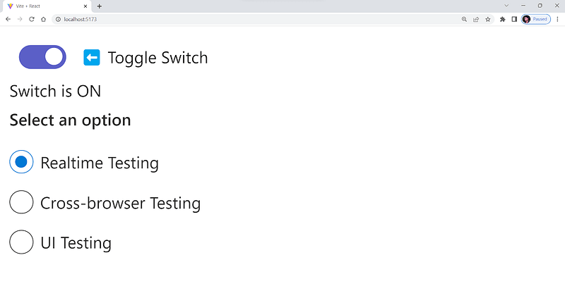
<Stack horizontalAlign="center">
<Stack.Item align="stretch">
<Switch
label=" ⬅️ Toggle Switch"
checked={isChecked}
onChange={handleCheckedChange}
/>
<div>{isChecked ? "Switch is ON" : "Switch is OFF"}</div>
<ChoiceGroup
label="Select an option"
selectedKey={selectedOption}
options={[
{ key: "option1", text: "Realtime Testing" },
{ key: "option2", text: " Cross-browser Testing " },
{ key: "option3", text: "UI Testing" },
]}
onChange={handleOptionChanged}
/>
</Stack.Item>
</Stack>
);
};
export default App;
Output:
Pros:
Accessibility: Fluent UI is designed with accessibility in mind, ensuring that users of all abilities can access and use it without difficulty.
Cross-platform Compatibility: Offers cross-platform design system that works seamlessly across various platforms, including web, mobile, and desktop applications.
Performance: Designed to perform optimally, providing a professional and user-friendly look and feel to your applications.
Cons:
Limited Customization: Offers many customizable components. Its level of customization may not be as extensive as that of other UI frameworks. This may limit the ability to design highly customized user interfaces.
Component Bloat: Offers a wide range of components, but not all of them may be necessary for every project. As a result, your codebase could become more difficult to maintain and optimize.
Limited Community Contributions: It has an active community, but there might not be as many plugins or contributions as there are for other popular CSS frameworks for React.
Evergreen
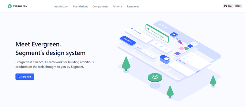
Evergreen is another well-known among various best CSS frameworks for React offered by Segment, designed to help create delightful software products. It’s also a design system that provides flexibility and doesn’t limit developers to any specific configuration or outdated integration.
Evergreen has around 12,872 weekly downloads, which has been steadily increasing over the past few months.
Installation
npm:
npm i evergreen-ui
Yarn:
Yarn add evergreen-ui
Let’s consider by taking an example for better understanding.
import * as React from "react";
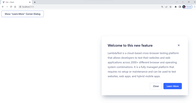
import { CornerDialog, Button } from "evergreen-ui";
const App = () => {
return <BasicCornerDialogExample />;
};
export default App;
function BasicCornerDialogExample() {
const [isShown, setIsShown] = React.useState(false);
return (
<React.Fragment>
<CornerDialog
title="Welcome to this new feature"
isShown={isShown}
onCloseComplete={() => setIsShown(false)}
>
LambdaTest is a cloud-based cross-browser testing platform that allows
developers to test their websites and web applications across 2000+
different browser and operating system combinations.
It is a fully managed platform that requires no setup or maintenance and
can be used to test websites, web apps, and hybrid mobile apps.
</CornerDialog>
<Button onClick={() => setIsShown(true)}>
Show “Learn More” Corner Dialog
</Button>
</React.Fragment>
);
}
Output:
Pros:
Flexible and customizable: Evergreen gives you much freedom to change things and make them your own. Developers can easily change the styles and components to fit their needs and brand identities.
User-friendly: Provides a user-friendly and intuitive design, making it easy for developers to use and implement in their applications.
Responsive: Designed to be responsive, making it easy to create interfaces that work well on desktop and mobile devices.
Cons:
Limited Theming Options: Evergreen doesn’t have a lot of theming options, and it will be hard to create highly customized themes that fit specific design requirements.
Limited Community Support: Smaller community than other popular UI frameworks.
Limited Resources: Since Evergreen is comparatively less used, it has limited resources compared to more established frameworks.
This Cypress automation testing tutorial will help you learn the benefits of Cypress automation, and how to install Cypress and execute Cypress automation testing over scores of browsers and operating systems online.
NextUI
NextUI is a versatile, open-source UI library from various best CSS frameworks for React that help developers to create impressive websites and applications. Its modern, fast, and visually appealing design makes it an attractive option for anyone looking to create a cutting-edge user experience.
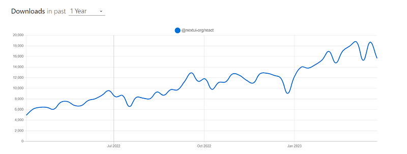
Although Next UI is in beta now, it is quite promising because it is a community-supported library and has gained around 18,000 downloads per week, according to npm. It has around 10K+ stars on GitHub, and more than 70 developers are working on this project.
Let’s consider taking an example for better understanding.
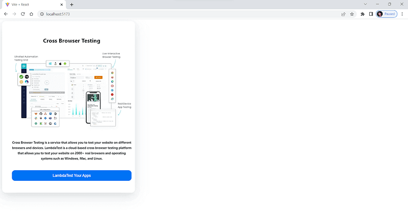
 import { Button, Card, Image, Text } from "@nextui-org/react";


export default function App() {
  return (
    <Card css={{ mw: "400px" }}>
      {/* center it */}
      <Card.Body css={{ textAlign: "center" }}>
        <Text h2>Cross Browser Testing</Text>


        <Image
          src="https://www.lambdatest.com/resources/images/main/home_banner.webp"
          alt="Cross Browser Testing"
          css={{ my: "1rem" }}
        />
        <Text h5>
          Cross Browser Testing is a service that allows you to test your
          website on different browsers and devices.
          LambdaTest is a cloud-based cross browser testing platform that
          allows you to test your website on 2000+ real browsers and
          operating systems such as Windows, Mac, and Linux.
        </Text>
        <Button css={{marginTop:15}}>LambdaTest Your Apps</Button>
      </Card.Body>
    </Card>
  );
}
Output:
Pros:
Faster: NextUI removes unnecessary style props during runtime. Because of this, the tool performs better than other React UI libraries.
Custom theming: Provides an easy way to customize the default theme to adapt to your design.
Server-side rendering: Its components make it simple to implement cross-browser server-side rendering in your applications.
Cons:
Newer Library: Currently in beta and is a relatively new UI library.
Chance for bugs: Still in the development phase and might have bugs and breaking changes.
Theme UI
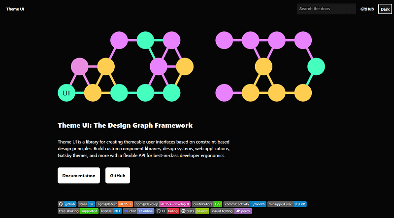
Theme UI is a design library for styling React-based applications that allow developers to create user interfaces that can be easily themed based on constraint-based design principles. Theme UI has great developer ergonomics and is built on the principles of constraint-based design.
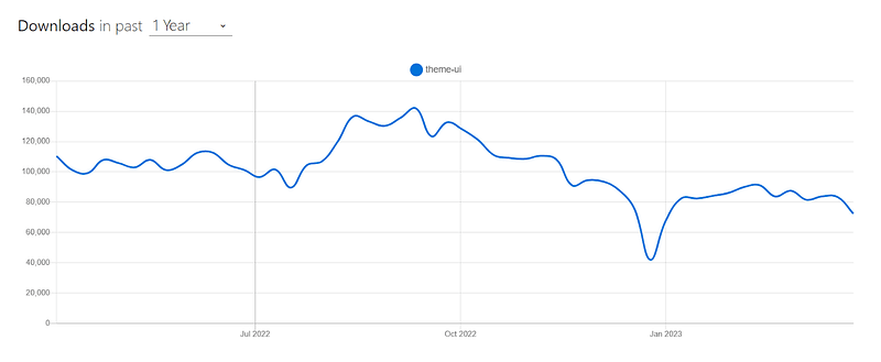
Theme UI has around 93,000 weekly downloads, according to the npm statistics. This indicates a growing user base and popularity within the React developer community.
Installation
npm:
npm install theme-ui @emotion/react
Yarn:
Yarn add theme-ui @emotion/react
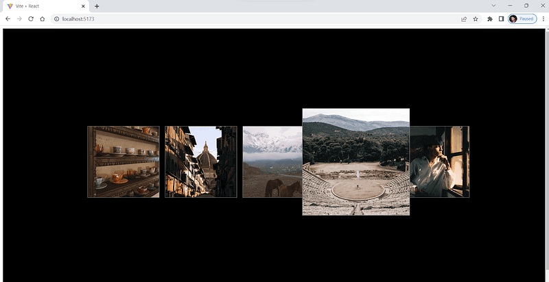
Let’s consider by taking an example for better understanding.
 import React, { useState } from "react";
import { Box, Image } from "theme-ui";


const ImageCarousel = () => {
  const [currentImageIndex, setCurrentImageIndex] = useState(0);
  const images = [
    "https://images.pexels.com/photos/15130357/pexels-photo-15130357.jpeg?auto=compress&cs=tinysrgb&w=1260&h=750&dpr=1",
    "https://images.pexels.com/photos/15316227/pexels-photo-15316227.jpeg?auto=compress&cs=tinysrgb&w=1260&h=750&dpr=1",
    "https://images.pexels.com/videos/7592810/cavalry-cold-dawn-daylight-7592810.jpeg",
    "https://images.pexels.com/photos/14437079/pexels-photo-14437079.jpeg?auto=compress&cs=tinysrgb&w=1260&h=750&dpr=1",
    "https://images.pexels.com/photos/14737533/pexels-photo-14737533.jpeg?auto=compress&cs=tinysrgb&w=1260&h=750&dpr=1",
  ];


  const handleImageClick = (index) => {
    setCurrentImageIndex(index);
  };


  return (
    <Box
      sx={{
        display: "flex",
        alignItems: "center",
        justifyContent: "center",
        height: "100vh",
        width: "100vw",
        backgroundColor: "black",
      }}
    >
      {images.map((src, index) => (
        <Box
          key={index}
          sx={{
            width: "200px",
            height: "200px",
            border: "1px solid gray",
            overflow: "hidden",
            cursor: "pointer",
            mx: 2,
            transition: "all .3s ease-in-out",
            transform: currentImageIndex === index ? "scale(1.5)" : "none",
          }}
          onClick={() => handleImageClick(index)}
        >
          <Image
            src={src}
            sx={{ width: "100%", height: "100%", objectFit: "cover" }}
          />
        </Box>
      ))}
    </Box>
  );
};


export default ImageCarousel;
Output:
Pros:
Ergonomic: Allows you to style your software products quickly as per your theme with excellent developer ergonomics.
Themeable: Developers can easily change how their websites or apps look and feel by referring to the values and applying them to any component they want.
Cons:
Newer: Relatively new library compared to some established libraries, making it confusing or challenging for new developers, especially if unfamiliar with React or styling libraries.
Less community support: Due to the growing community, it does not have as many resources, support, or plugins available for developers.
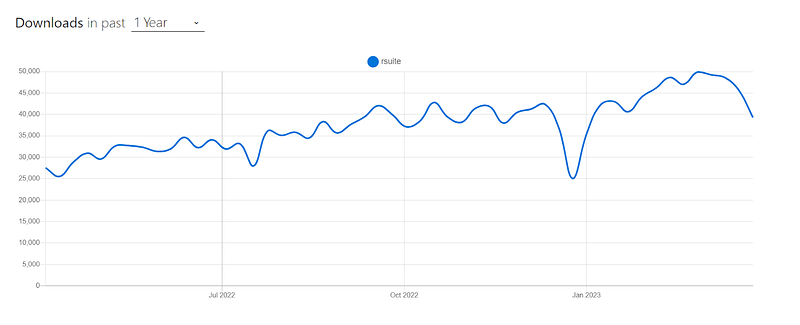
React Suite
React Suite is a popular open-source React-based UI library, among other best CSS frameworks for React, which offers a wide range of components that can be changed and reused again. These components include everything from simple user interfaces elements like buttons and forms to more complicated ones like data tables and charts. This makes it a great choice for developers who want to make web apps that look professional and have many features.
React Suite has around 45,552 weekly downloads, according to npm statistics, and it is a well-maintained project with around 100 developers actively working on it.
Installation
npm:
npm i rsuite
Yarn:
Yarn add rsuite
Let’s consider taking an example for better understanding.
import React from "react";
import { Modal, Button, ButtonToolbar, Placeholder } from "rsuite";
import "rsuite/styles/index.less";
export default function App() {
const [open, setOpen] = React.useState(false);
const handleOpen = () => setOpen(true);
const handleClose = () => setOpen(false);
return (
<>
<ButtonToolbar>
<Button onClick={handleOpen}> Open</Button>
</ButtonToolbar>
<Modal open={open} onClose={handleClose}>
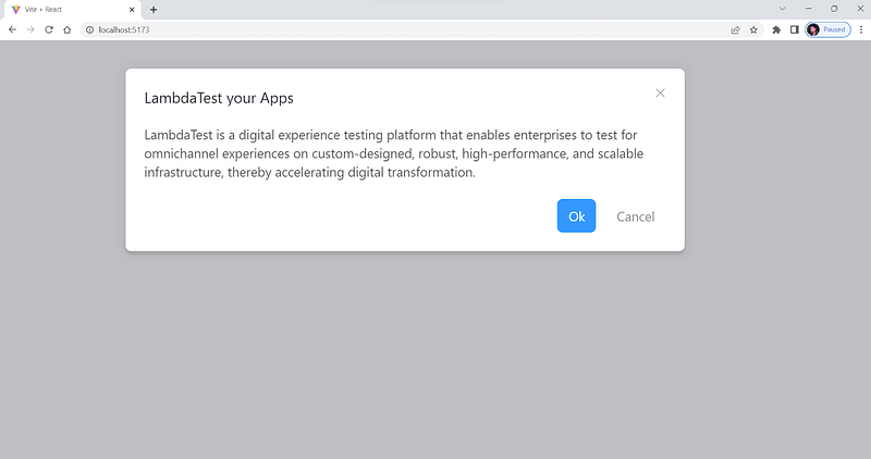
<Modal.Header>
<Modal.Title>LambdaTest your Apps
</Modal.Title>
</Modal.Header>
<Modal.Body>
LambdaTest is a digital experience testing platform that enables
enterprises to test for omnichannel experiences on custom-designed,
robust, high-performance, and scalable infrastructure, thereby
accelerating digital transformation.
</Modal.Body>
<Modal.Footer>
<Button onClick={handleClose} appearance="primary">
Ok
</Button>
<Button onClick={handleClose} appearance="subtle">
Cancel
</Button>
</Modal.Footer>
</Modal>
</>
);
}
Output:
Pros:
Highly customizable: Offers a large number of customizable UI components for building feature-rich web applications.
Support for Arabic and Hebrew: Provides out-of-the-box support for Arabic and Hebrew languages and customizable themes for a personalized user experience.
Cons:
Poorly documented: The documentation feels insufficient or difficult to navigate in certain areas.
Not widely used: The library may not be as popular as some of its competitors, which could make resources and community support harder to find.
React Spectrum
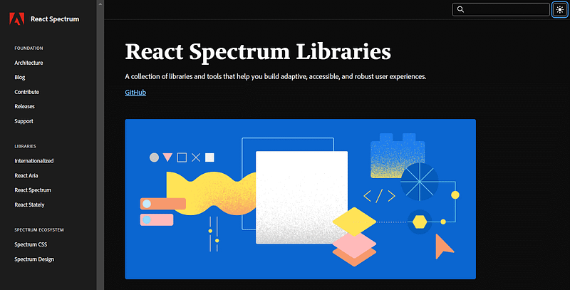
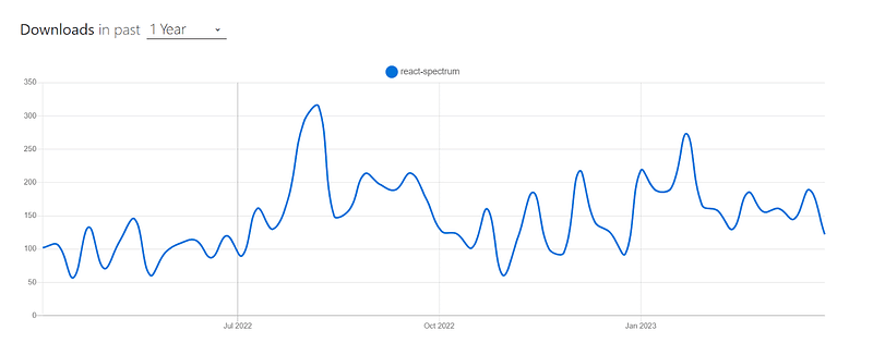
React Spectrum is a well-known cutting-edge UI library among the list of best CSS frameworks for React that provides a wide array of customizable and accessible components for creating top-tier web applications. Based on the Adobe Spectrum Design System, this library is designed to deliver a streamlined and unified set of tools for building visually striking and user-friendly interfaces that will delight users.
React spectrum has around 8,705 weekly downloads according to npm statistics, indicating a decent level of popularity among React developers.
Installation
npm:
npm i @adobe/react-spectrum
Yarn:
yarn add @adobe/react-spectrum
Let’s consider taking an example for better understanding.
import { RangeCalendar } from "@adobe/react-spectrum";


export default function Example() {
  let [action, setAction] = React.useState(null);


  return (
    <>
     <RangeCalendar aria-label="Trip dates" />


    </>
  );
}
Output:
Pros:
Unified design: Adobe React Spectrum has a complete design system with guidelines, resources, and tools for making interfaces that look good and are the same across all Adobe products and platforms.
Accessibility oriented: The design system is built with accessibility in mind, making it easier for developers to create interfaces that are inclusive and accessible to users with special abilities.
Cons:
Learning curve: The design system and UI library are well-documented, but it may still take some time for developers to fully understand and use Adobe Spectrum’s features and capabilities.
Less community support: Comparably less used, which results in limited community support and resources.
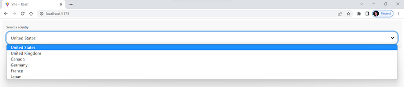
Gestalt
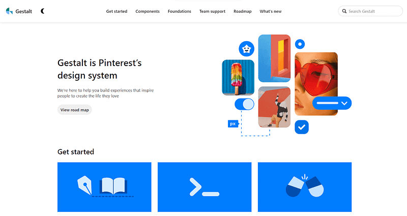
Gestalt is a user-friendly design system developed by Pinterest and is one of the best CSS frameworks for React. It includes various customizable UI components, from simple buttons and forms to more advanced navigation and data visualization tools.
The UI components in Gestalt are designed to be responsive, adapting to different screen sizes and resolutions. This ensures that applications built with Gestalt will look great on any device, from mobile phones to large desktop monitors.
Gestalt has around 22,000 weekly downloads; the current stable version is v101.3.9.
Installation
npm:
npm i gestalt
Yarn:
yarn add gestalt
Let’s consider taking an example for better understanding.
 import { Box, SelectList } from 'gestalt';
import 'gestalt/dist/gestalt.css';


export default function SelectExample() {
  return (
    <Box width="100%" height="100%" padding={4}>
      <SelectList
        id="selectlistexample1"
        label="Select a country"
        onChange={() => {}}
        size="lg"
      >
        {[
          { label: 'United States', value: 'us' },
          { label: 'United Kingdom', value: 'uk' },
          { label: 'Canada', value: 'canada' },
          { label: 'Germany', value: 'germany' },
          { label: 'France', value: 'france' },
          { label: 'Japan', value: 'japan' },
        ].map(({ label, value }) => (
          <SelectList.Option key={value} label={label} value={value} />
        ))}
      </SelectList>
    </Box>
  );
}
Output:
Pros:
Maintained by Pinterest: Gestalt is maintained by Pinterest and which shows there is a promising future ahead for it.
Customizable: Provides various customizable and reusable UI components for building modern web applications.
Cons:
Limited components: Has a limited number of components compared to some other established React UI libraries.
Not apt for a high level of customization: It might not be a good choice for projects that require a high level of customization or unique design elements, as the library is designed to offer a cohesive and consistent visual language across all components.
Run your Jest automation tests in massive parallel across multiple browser and OS combinations with LambdaTest, Read more
PrimeReact
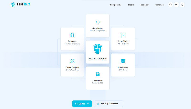
PrimeReact is a React-based UI component library, another well-known and among the best CSS frameworks for React that has been adopted by various businesses and developers worldwide. Major companies like Mercedes, Airbus, Ford, Fox, Volkswagen, eBay, Intel, Nvidia, Verizon, and American Express have all used it.
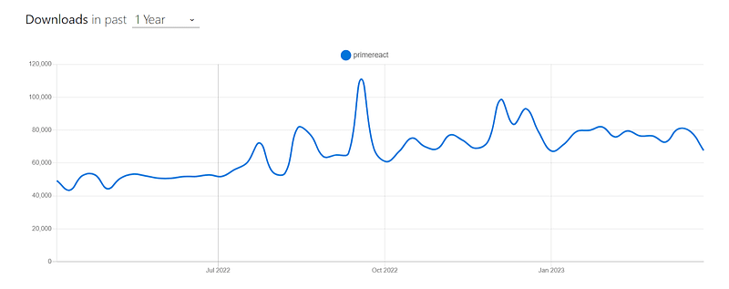
PrimeReact has more than 78,900 weekly downloads and 3.7K+ GitHub stars. It has many features and components that can help you make better user interfaces.
Installation
npm:
npm i primereact
Yarn:
Yarn add primereact
Let’s consider taking an example for better understanding.
import React, { useState, useEffect } from "react";
import { Chart } from "primereact/chart";
import { Card } from "primereact/card";


export default function FrameworkChart() {
  const [chartData, setChartData] = useState({});
  const [chartOptions, setChartOptions] = useState({});


  useEffect(() => {
    const data = {
      labels: ["2018", "2019", "2020", "2021", "2022"],
      datasets: [
        {
          label: "React",
          data: [100, 200, 400, 800, 1600],
          fill: false,
          borderColor: "#61dafb",
          tension: 0.4,
        },
        {
          label: "Vue",
          data: [50, 100, 200, 400, 800],
          fill: false,
          borderColor: "#41b883",
          tension: 0.4,
        },
        {
          label: "Angular",
          data: [20, 50, 100, 200, 400],
          fill: false,
          borderColor: "#c3002f",
          tension: 0.4,
        },
        {
          label: "Ember",
          data: [5, 10, 20, 40, 80],
          fill: false,
          borderColor: "#e04e39",
          tension: 0.4,
        },
      ],
    };


    const options = {
      maintainAspectRatio: false,
      aspectRatio: 0.6,
      plugins: {
        legend: {
          labels: {
            color: "#000",
          },
        },
      },
      scales: {
        x: {
          ticks: {
            color: "#000",
          },
          grid: {
            color: "#ccc",
          },
        },
        y: {
          ticks: {
            color: "#000",
          },
          grid: {
            color: "#ccc",
          },
        },
      },
    };


    setChartData(data);
    setChartOptions(options);
  }, []);


  return (
    <Card style={{ font: 24 }} title="Frontend Framework Popularity">
      <Chart type="line" data={chartData} options={chartOptions} />
    </Card>
  );
}
Output:
Pros:
Design Agnostic: Works with existing design libraries like Bootstrap and Material UI but also allows you to create your unique design.
Theme Designer: Includes a GUI-based Theme Designer with over 500 customizable variables for modifying color, font, size, input style, buttons, and more.
Large Community: A large and active community provides helpful resources and support to developers, and more than 15K projects use Primereact.
Cons:
Limited Customization: While PrimeReact offers a lot of pre-built components, there may be limitations to the level of customization that can be achieved.
Complexity: Due to many features and components, PrimeReact can be more complex and challenging to learn for beginners.
Belle
Among various best CSS frameworks for React, Belle is mostly new and consists of a collection of React UI components that aims to offer reusable and customizable components for creating excellent web applications. Users of all abilities can easily use and navigate through the web application thanks to Belle’s components, which were created with accessibility in mind.
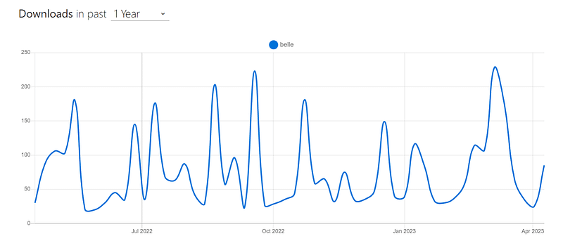
source
Pros:
Customizable: Offers a good range of customizable components for React-based UI development.
Well-documented: Belle is well-documented and has a great user community that constantly contributes to the framework.
Lightweight: Ideal for quick and responsive development.
Browser support: Can be worked with all modern browsers and mobile devices.
Cons:
Limited components: Do not have as many components as some of the other best CSS frameworks for React. Hence it limits its flexibility in specific scenarios.
No Built-in support: Does not provide built-in support for CSS preprocessors like Sass or Less.
Griddle
Griddle is a React-based grid component that aids in creating responsive design templates like tables, lists, and grids with features like filtering, sorting, pagination, and more. For handling large datasets in React applications, Griddle aims to be a quick and straightforward solution.
Griddle offers a flexible API and adaptable styling options to fit a range of use cases. Developers can use Griddle to make dynamic tables and grids that make it simple for users to interact and navigate through data.
Pros:
High level of customization: Allows developers to create custom components.
Easily accessible: Easy for users to navigate and interact with the application.
Lightweight: Easily integrated with other libraries.
Extensive documentation: Easy for developers to learn and use.
Cons:
Steep learning curve: New users may find using it challenging.
Limited built-in functionality: Have minimal built-in component functionality compared to other libraries.
Smaller community: Limited support and updates, making it less choice for developers.
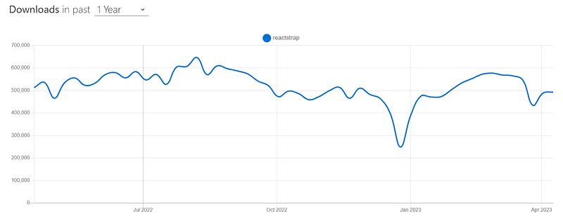
Reactstrap
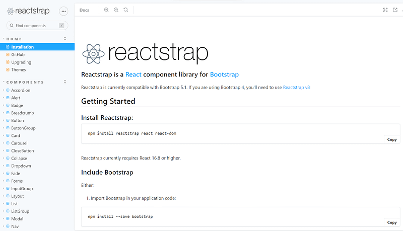
Reactstrap is a popular React UI library built on top of Bootstrap, and it is one of the most popular and comprehensive libraries among various CSS frameworks for React. It provides pre-built React components designed to work with Bootstrap styles and utilities, making it easy to create responsive and mobile-friendly web applications.
Reactstrap includes a wide range of components, such as navigation bars, forms, modals, buttons, and more. It also supports server-side rendering and has good documentation with examples. The library is open source and maintained by the community.
Pros:
Pre-built components: Provides pre-built components, making it easy to create complex UI layouts.
Easy to learn: As developers are already familiar with Bootstrap, it is easy to get started with Reactstrap.
Excellent documentation: This offers good documentation, and a large community of developers is available to help.
Cons:
Not highly customizable: Reactstrap relies heavily on Bootstrap, which can sometimes be difficult to customize components.
Slow loading: The CSS generated by Reactstrap can be bloated and slow to load.
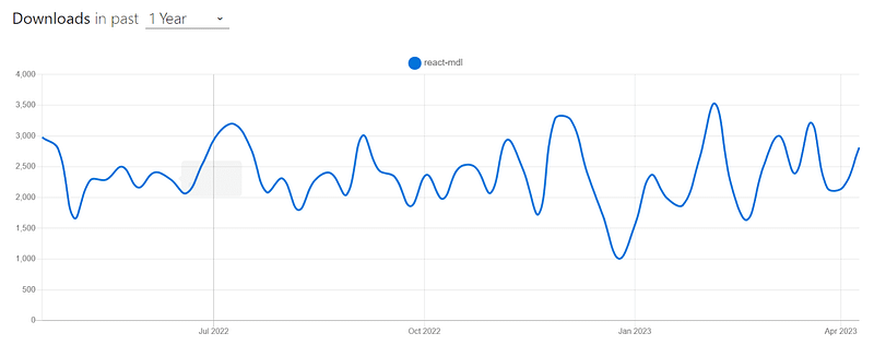
React-MDL

React-MDL is a UI library and is one of the popular CSS frameworks for React that offers programmers a collection of reusable and adaptable components to create web applications. It is built using Material Design Lite, a simplified version of Google’s Material Design principles.
React-MDL is a well-liked option for developing web applications with React because it is simple to use and has great documentation.
Pros:
Easy to learn: Easy to learn and implement, making it a good choice for beginners.
Vast components: It provides a wide range of components for UI development, including responsive layouts, forms, and typography.
Well-documentation: It is well-documented and supported by a large community of developers, ensuring continued updates and bug fixes.
Cons:
Limited customization options: Restrictive for more complex projects due to limited customizable options available.
Less responsive: Some components may not be fully responsive, which can cause issues on certain devices.
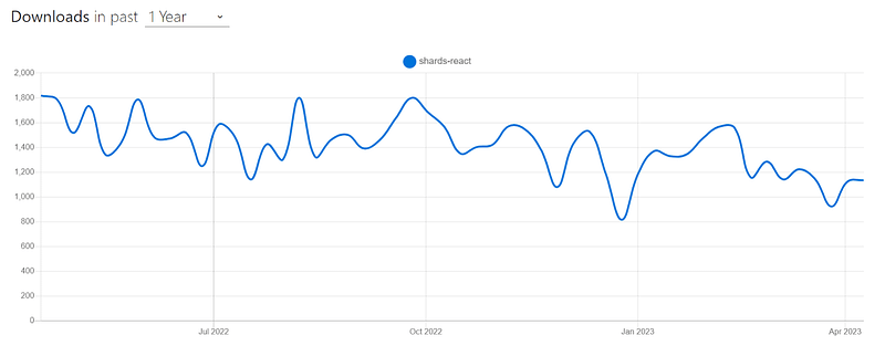
Shards React
Shards React is a UI framework for creating user interfaces in React applications. It offers pre-built and editable elements, including buttons, forms, navigation bars, and more. The framework is responsive and mobile-friendly by default because it is constructed on top of Bootstrap.
Shards React also includes additional features, such as customizable themes, a built-in icon library, and support for various JavaScript libraries. It is designed to be lightweight and flexible, which allows developers to easily integrate it into their projects and customize it as needed.
Pros:
Excellent documentation: Provides great documentation and support for the framework.
Lightweight: Easy to use, making it ideal for small and large projects.
Responsive layouts: Offers a comprehensive set of components for responsive design.
Cons:
Limited customization options: Not suitable for highly specific designs.
Difficult to integrate: Integrating other frameworks and libraries can be challenging.
Limited community support: Due to fewer updates and less usage, its community support is less compared to other frameworks.
Choosing the Right CSS Framework for React-Based Applications
We have gone through a long list of the 23 best CSS frameworks for React. Each year, there are new additions to the list, making it even harder to choose the right one.
When picking the right CSS framework for React-based applications, it’s important to consider your project’s needs. It is important to note that installing a heavy package for simple UI elements can increase loading time and slow down your application. In this section of the blog on the best CSS frameworks for React, we will look into some of the aspects you must consider while picking the best CSS frameworks for React and a component library for your testing needs.
Cross Browser Compatibility
Cross browser compatibility is an important factor when choosing the best CSS frameworks for React among the various options available. Some new UI libraries focus on the more recent versions of React, and they might need to be compatible with older versions. It can be a challenging time for developers who will use those libraries.
Some React UI component libraries may not be compatible with all major browsers and devices, which can result in issues with the user experience and functionality of your web application. For instance, if a UI library heavily relies on CSS, there is a probability that the CSS properties are specific to certain platforms and may not function as intended.
One way you can verify and test compatibility is to check if the library supports major browsers and devices using a cloud-based digital experience testing platform like LambdaTest that provides comprehensive cross browser testing capabilities.
LambdaTest is a cloud-based unified intelligent digital experience testing platform that allows developers and testers to perform manual and automated testing over a wide range of browsers and real devices. Additionally, LambdaTest also offers a wide range of integrations with popular automation testing frameworks like Selenium, Appium, and Playwright, allowing you to test React applications into your existing testing workflow seamlessly.
To get started with LambdaTest, watch this complete tutorial and start testing your React-based websites or web apps today.
%[INVALID_URL]Subscribe to the LambdaTest YouTube Channel for more updates and comprehensive tutorials around Selenium testing, Cypress testing, and more.
In this article, we take a look at some aspects of simulation and discuss some ways through which we can use iPhone emulator for Windows.
Documentation
UI libraries like Material UI have gained significant popularity, and one of the reasons for this is their well-documented API and usage examples. Proper documentation not only helps developers understand how to use the library effectively, but it also helps them to debug and fix issues.
One noticeable feature of popular libraries like Material UI is the overall flow of the documentation. Material UI’s documentation is well-structured and easy to follow, making it easy to find what you need and get started with the library. Each component is well explained with code as well as a live example.
Most UI libraries try to keep their documentation up-to-date and thorough to ensure that developers have the necessary resources to use their components effectively. From the examples above, it’s clear that developers find it much easier to understand and use the different parts and features of a UI library when the documentation is clear and well-organized.
While evaluating a UI library, look for API references, usage examples, and code snippets that demonstrate how to use the library’s components and features. It is also a good practice to check the GitHub repository and issues section for the UI library you are considering. This can give you a better idea of the development activity and community support for the library.
Ease of Customization
While choosing the best CSS frameworks for React from the list of the best CSS frameworks, it is important to consider the level of customization it provides. Some libraries may limit the amount of customization possible, while others may offer extensive options for customization.
Most organizations have their own brand colors and aesthetics. When using a UI library, it is important to ensure that it provides the flexibility to customize the look and feel of the UI to match your brand. This includes options for modifying colors, typography, and other styling elements.
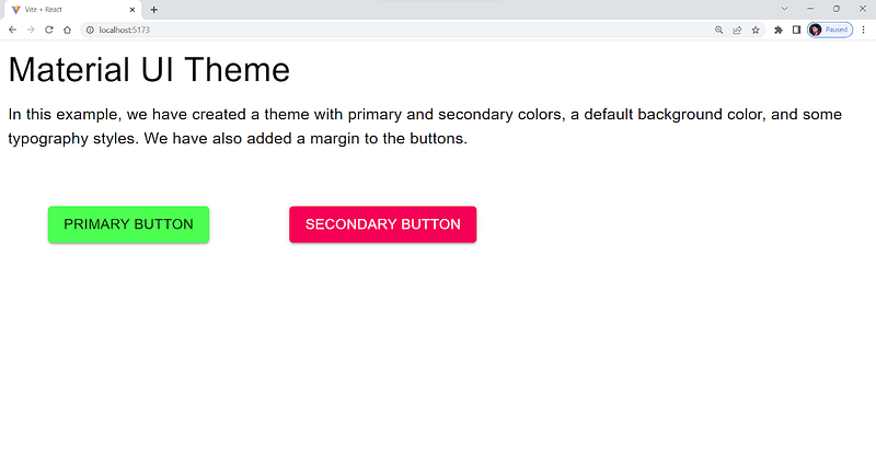
The following example shows how we can override the default style and create custom styling of a Material UI button.
import { Button, Typography } from "@mui/material";
import { ThemeProvider } from "@mui/material/styles";
import { createTheme } from "@mui/material/styles";


const theme = createTheme({
  palette: {
    primary: {
      main: "#4cff50",
    },
    secondary: {
      main: "#f50057",
    },
    background: {
      default: "#f5f5f5",
      paper: "#ffffff",
    },
    text: {
      primary: "#333333",
      secondary: "#666666",
    },
  },
});


function App() {
  return (
    <ThemeProvider theme={theme}>
      <div>
        <Typography variant="h4" gutterBottom>
          Material UI Theme
        </Typography>
        <Typography variant="body1" paragraph>
          In this example, we have created a theme with primary and secondary
          colors, a default background color, and some typography styles. We
          have also added a margin to the buttons.
        </Typography>
        <Button variant="contained" color="primary" sx={{ margin: 5 }}>
          Primary Button
        </Button>
        <Button variant="contained" color="secondary" sx={{ margin: 5 }}>
          Secondary Button
        </Button>
      </div>
    </ThemeProvider>
  );
}


export default App;
Output:
Also, look for libraries that offer a wide range of pre-built components and the ability to create your custom components easily. One thing to note when using an extensive library is that it can increase the project size and the page load time in slower networks.
Learning Curve
It’s crucial to think about the learning curve when deciding on a user interface framework or component library. Some libraries, such as Semantic UI React, are more complex and challenging to use. On the other hand, some libraries, like Material UI, are more straightforward and scalable. Material UI has the largest UI community in the React ecosystem. It has been around since 2014, almost as long as React itself.
Search for libraries with thorough documentation, tutorials, and community support to make learning easier. This can help you quickly get up to speed on the library’s features and functionality and provide a valuable resource if you run into any issues or have questions.
Performance
Performance is considered the key to the success of any web application. A fast and responsive application can provide users with a smooth and seamless experience, making them more likely to engage with your product and return in the future.
When choosing a UI library for your app, it’s important to pay attention to its performance. You want to avoid ending up with a library that slows down your app’s loading time or negatively affects its performance.
It’s a good idea to look for libraries that offer optimization options, such as code splitting and lazy loading. These features can help improve your app’s performance by reducing the amount of code that needs to be loaded at once.
Accessibility
Accessibility is one of the most important aspects of software development. While choosing the best CSS frameworks for React, it’s important to consider accessibility as one of the key factors. An accessible UI library can help you build an inclusive app that everyone, including people with special abilities, can use.
To ensure that your app is fully accessible, you should look for libraries that offer accessibility testing features, such as keyboard navigation and screen reader support. These features can help users with special abilities to navigate and interact with your app more easily.
Also, make sure that the library you chose follows accessibility standards such as WCAG. This can help ensure that your app complies with accessibility laws and regulations. Some libraries, like Semantic UI React, have accessibility issues addressed by the community, which can make UI components hard to use for people with special abilities.
Selenium WebdriverIO is a Javascript-based test automation framework built over nodeJs. Learn with this guide how to use webdriverIO to perform web automation testing.
Material UI vs. Semantic UI: Comparison with LT Browser 2.0
Let’s now look at an example where we try to replicate the same UI using Material UI and Semantic UI and then check the responsiveness score using LT Browser 2.0. We will also look into the performance score.
Semantic UI React
We will use Semantic UI React to build a registration form component with a few form components like form, checkbox, and button.
Let’s consider taking an example for better understanding.
import React, { useState } from 'react';
import { Container, Form, Checkbox, Button } from 'semantic-ui-react';
import 'semantic-ui-css/semantic.min.css'


function RegistrationForm() {
  const [formData, setFormData] = useState({
    firstName: '',
    lastName: '',
    email: '',
    password: '',
    confirmPassword: '',
    age: '',
    gender: '',
    address: '',
    phoneNumber: '',
    agreeTerms: false,
  });


  const [formErrors, setFormErrors] = useState({});


  const handleInputChange = (event, { name, value, checked }) => {
    setFormData((prevState) => ({
      ...prevState,
      [name]: name === 'agreeTerms' ? checked : value,
    }));
  };


  const handleSubmit = (event) => {
    event.preventDefault();


    // Validate form data
    const errors = {};


    if (!formData.firstName) {
      errors.firstName = 'Please enter your first name';
    }


    if (!formData.lastName) {
      errors.lastName = 'Please enter your last name';
    }


    if (!formData.email) {
      errors.email = 'Please enter your email address';
    } else if (!/^[^\s@]+@[^\s@]+\.[^\s@]+$/.test(formData.email)) {
      errors.email = 'Please enter a valid email address';
    }


    if (!formData.password) {
      errors.password = 'Please enter a password';
    } else if (formData.password.length < 6) {
      errors.password = 'Password must be at least 6 characters long';
    }


    if (formData.password !== formData.confirmPassword) {
      errors.confirmPassword = 'Passwords do not match';
    }


    if (!formData.age) {
      errors.age = 'Please enter your age';
    } else if (formData.age < 18) {
      errors.age = 'You must be at least 18 years old to register';
    }


    if (!formData.gender) {
      errors.gender = 'Please select your gender';
    }


    if (!formData.address) {
      errors.address = 'Please enter your address';
    }


    if (!formData.phoneNumber) {
      errors.phoneNumber = 'Please enter your phone number';
    } else if (!/^\d{10}$/.test(formData.phoneNumber)) {
      errors.phoneNumber = 'Please enter a valid phone number';
    }


    if (!formData.agreeTerms) {
      errors.agreeTerms = 'You must agree to the terms and conditions';
    }


    setFormErrors(errors);


    // Submit form data if there are no errors
    if (Object.keys(errors).length === 0) {
      console.log(formData);
    }
  };


  const {
    firstName,
    lastName,
    email,
    password,
    confirmPassword,
    age,
    gender,
    address,
    phoneNumber,
    agreeTerms,
  } = formData;


  return (
    <Container>
      <h2>
        Registration Form
      </h2>
      <Form onSubmit={handleSubmit}>
        <Form.Input
          label="First Name"
          name="firstName"
          value={firstName}
          onChange={handleInputChange}
          required
          error={formErrors.firstName}
        />
        <Form.Input
          label="Last Name"
          name="lastName"
          value={lastName}
          onChange={handleInputChange}
          required
          error={formErrors.lastName}
        />
        <Form.Input
          label="Email"
          name="email"
          type="email"
          value={email}
          onChange={handleInputChange}
          required
          error={formErrors.email}
        />
        <Form.Input
          label="Password"
          name="password"
          type="password"
          value={password}
          onChange={handleInputChange}
          required
          error={formErrors.password}
          />
          <Form.Input
            label="Confirm Password"
            name="confirmPassword"
            type="password"
            value={confirmPassword}
            onChange={handleInputChange}
            required
            error={formErrors.confirmPassword}
          />
          <Form.Input
            label="Age"
            name="age"
            type="number"
            value={age}
            onChange={handleInputChange}
            required
            error={formErrors.age}
          />
          <Form.Group inline>
            <label>Gender</label>
            <Form.Radio
              label="Female"
              name="gender"
              value="female"
              checked={gender === 'female'}
              onChange={handleInputChange}
              required
              error={formErrors.gender}
            />
            <Form.Radio
              label="Male"
              name="gender"
              value="male"
              checked={gender === 'male'}
              onChange={handleInputChange}
              required
              error={formErrors.gender}
            />
            <Form.Radio
              label="Other"
              name="gender"
              value="other"
              checked={gender === 'other'}
              onChange={handleInputChange}
              required
              error={formErrors.gender}
            />
          </Form.Group>
          <Form.Input
            label="Address"
            name="address"
            value={address}
            onChange={handleInputChange}
            required
            error={formErrors.address}
          />
          <Form.Input
            label="Phone Number"
            name="phoneNumber"
            type="tel"
            pattern="[0-9]{10}"
            value={phoneNumber}
            onChange={handleInputChange}
            required
            error={formErrors.phoneNumber}
          />
          <Form.Checkbox
            label="I agree to the terms and conditions"
            name="agreeTerms"
            checked={agreeTerms}
            onChange={handleInputChange}
            required
            error={formErrors.agreeTerms}
          />
          <Button type="submit" primary>
            Submit
          </Button>
          <Button type="button" secondary>
            Cancel
          </Button>
        </Form>
      </Container>
      );
      }

      export default RegistrationForm;
Output:
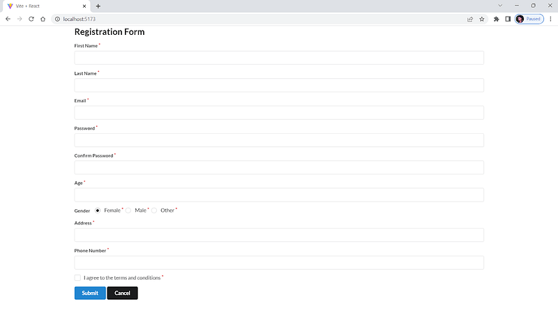
Responsiveness Score:
Performance Score:
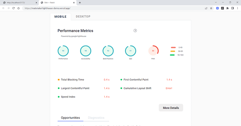
Material UI
Now, we will try replicating the Semantic UI form component into the Material UI component. Note that a replica may only sometimes be possible due to differences in the design systems and available features. However, we aim to create a similar form using Material UI and compare the two in terms of aesthetics and functionality.
Let’s consider taking an example for better understanding.
import React, { useState } from "react";
import {
  Typography,
  Grid,
  Paper,
  TextField,
  Button,
  FormControl,
  FormControlLabel,
  Checkbox,
  FormHelperText,
  Select,
  MenuItem,
  RadioGroup,
  Radio,
  FormLabel,
} from "@mui/material";
import { createTheme, ThemeProvider } from "@mui/material/styles";
import { blue } from "@mui/material/colors";


const theme = createTheme({
  palette: {
    primary: {
      main: blue[500],
    },
  },
});


function RegistrationForm() {
  const [formData, setFormData] = useState({
    firstName: "",
    lastName: "",
    email: "",
    password: "",
    confirmPassword: "",
    age: "",
    gender: "",
    address: "",
    phoneNumber: "",
    agreeTerms: false,
  });


  const [formErrors, setFormErrors] = useState({});


  const handleInputChange = (event) => {
    const { name, value, checked } = event.target;
    setFormData((prevState) => ({
      ...prevState,
      [name]: name === "agreeTerms" ? checked : value,
    }));
  };


  const handleSubmit = (event) => {
    event.preventDefault();


    // Validate form data
    const errors = {};


    if (!formData.firstName) {
      errors.firstName = "Please enter your first name";
    }


    if (!formData.lastName) {
      errors.lastName = "Please enter your last name";
    }


    if (!formData.email) {
      errors.email = "Please enter your email address";
    } else if (!/^[^\s@]+@[^\s@]+\.[^\s@]+$/.test(formData.email)) {
      errors.email = "Please enter a valid email address";
    }


    if (!formData.password) {
      errors.password = "Please enter a password";
    } else if (formData.password.length < 6) {
      errors.password = "Password must be at least 6 characters long";
    }


    if (formData.password !== formData.confirmPassword) {
      errors.confirmPassword = "Passwords do not match";
    }


    if (!formData.age) {
      errors.age = "Please enter your age";
    } else if (formData.age < 18) {
      errors.age = "You must be at least 18 years old to register";
    }


    if (!formData.gender) {
      errors.gender = "Please select your gender";
    }


    if (!formData.address) {
      errors.address = "Please enter your address";
    }


    if (!formData.phoneNumber) {
      errors.phoneNumber = "Please enter your phone number";
    } else if (!/^\d{10}$/.test(formData.phoneNumber)) {
      errors.phoneNumber = "Please enter a valid phone number";
    }


    if (!formData.agreeTerms) {
      errors.agreeTerms = "You must agree to the terms and conditions";
    }


    setFormErrors(errors);


    // Submit form data if there are no errors
    if (Object.keys(errors).length === 0) {
      console.log(formData);
    }
  };


  const {
    firstName,
    lastName,
    email,
    password,
    confirmPassword,
    age,
    gender,
    address,
    phoneNumber,
    agreeTerms,
  } = formData;


  return (
    <ThemeProvider theme={theme}>
      <Typography variant="h2" mb={3}></Typography>
      <Grid
        display="flex"
        justifyContent="center"
        alignItems="center"
        sx={{
          minHeight: "100vh",
          // background: "red",
          width: "fit-content",
          margin: "auto",
        }}
      >
        <Grid container spacing={4} sx={{width:"fit-content",margin:"auto",display:"flex",justifyContent:"center",}}>
          <Grid item xs={12} md={8}>
            <Paper sx={{ p: 4 }} elevation={3}>
              <Typography variant="h5" mb={3}>
                Registration Form
              </Typography>
              <form onSubmit={handleSubmit}>
                <Grid container spacing={2}>
                  <Grid item xs={12} md={6}>
                    <TextField
                      fullWidth
                      label="First Name"
                      name="firstName"
                      variant="outlined"
                      margin="normal"
                      value={firstName}
                      onChange={handleInputChange}
                      required
                      error={formErrors.firstName}
                      helperText={formErrors.firstName}
                    />
                  </Grid>
                  <Grid item xs={12} md={6}>
                    <TextField
                      fullWidth
                      label="Last Name"
                      name="lastName"
                      variant="outlined"
                      margin="normal"
                      value={lastName}
                      onChange={handleInputChange}
                      required
                      error={formErrors.lastName}
                      helperText={formErrors.lastName}
                    />
                  </Grid>
                  <Grid item xs={12}>
                    <TextField
                      fullWidth
                      label="Email"
                      name="email"
                      variant="outlined"
                      margin="normal"
                      value={email}
                      onChange={handleInputChange}
                      type="email"
                      required
                      error={formErrors.email}
                      helperText={formErrors.email}
                    />
                  </Grid>
                  <Grid item xs={12} md={6}>
                    <TextField
                      fullWidth
                      label="Password"
                      name="password"
                      variant="outlined"
                      margin="normal"
                      value={password}
                      onChange={handleInputChange}
                      type="password"
                      required
                      error={formErrors.password}
                      helperText={formErrors.password}
                    />
                  </Grid>
                  <Grid item xs={12} md={6}>
                    <TextField
                      fullWidth
                      label="Confirm Password"
                      name="confirmPassword"
                      variant="outlined"
                      margin="normal"
                      value={confirmPassword}
                      onChange={handleInputChange}
                      type="password"
                      required
                      error={formErrors.confirmPassword}
                      helperText={formErrors.confirmPassword}
                    />
                  </Grid>
                  <Grid item xs={12} md={6}>
                    <TextField
                      fullWidth
                      label="Age"
                      name="age"
                      variant="outlined"
                      margin="normal"
                      value={age}
                      onChange={handleInputChange}
                      type="number"
                      required
                      error={formErrors.age}
                      helperText={formErrors.age}
                    />
                  </Grid>
                  <Grid item xs={12} md={6}>
                    <FormControl fullWidth required error={formErrors.gender}>
                      <FormLabel component="legend">Gender</FormLabel>
                      <RadioGroup
                        row
                        aria-label="gender"
                        name="gender"
                        value={gender}
                        onChange={handleInputChange}
                      >
                        <FormControlLabel
                          value="female"
                          control={<Radio color="primary" />}
                          label="Female"
                        />
                        <FormControlLabel
                          value="male"
                          control={<Radio color="primary" />}
                          label="Male"
                        />
                        <FormControlLabel
                          value="other"
                          control={<Radio color="primary" />}
                          label="Other"
                        />
                      </RadioGroup>
                      {formErrors.gender && (
                        <FormHelperText>{formErrors.gender}</FormHelperText>
                      )}
                    </FormControl>
                  </Grid>
                  <Grid item xs={12}>
                    <TextField
                      fullWidth
                      label="Address"
                      name="address"
                      variant="outlined"
                      margin="normal"
                      value={address}
                      onChange={handleInputChange}
                      required
                      error={formErrors.address}
                      helperText={formErrors.address}
                    />
                  </Grid>
                  <Grid item xs={12}>
                    <FormControl required error={formErrors.agreeTerms}>
                      <FormControlLabel
                        control={
                          <Checkbox
                            color="primary"
                            name="agreeTerms"
                            checked={agreeTerms}
                            onChange={handleInputChange}
                          />
                        }
                        label="I agree to the terms and conditions"
                      />
                      {formErrors.agreeTerms && (
                        <FormHelperText>{formErrors.agreeTerms}</FormHelperText>
                      )}
                    </FormControl>
                  </Grid>
                  <Grid item xs={12}>
                    <Button
                      variant="contained"
                      color="primary"
                      size="large"
                      type="submit"
                    >
                      Submit
                    </Button>


                    <Button
                      variant="contained"
                      color="error"
                      size="large"
                      type="submit"
                      sx={{ ml: 2 }}
                    >
                      Cancel
                    </Button>
                  </Grid>
                </Grid>
              </form>
            </Paper>
          </Grid>
        </Grid>
      </Grid>
    </ThemeProvider>
  );
}


export default RegistrationForm;
Output:
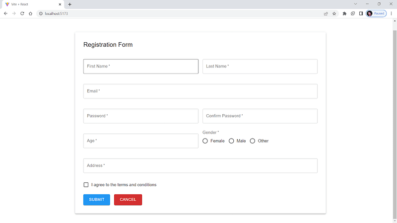
Responsiveness Score:
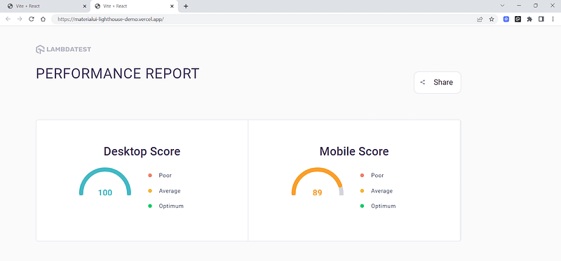
Performance Score:

As you can see from the responsiveness and performance report of both Material UI and Semantic UI React in LT Browser 2.0, Material UI is more optimized for responsive web design and performs better than Semantic UI.
With that being said, choose the React UI library that meets all your requirements and is a good fit for the scope of your project. One way to make a more informed decision is to try different libraries and conduct some testing to determine which one best meets your needs. This may involve building prototypes or performing UI testing to see how the different libraries perform.
Wrapping Up!
Congratulations on making it to the end of this blog!
We have covered a range of options for frameworks for React. We also discussed the key factors to consider while selecting the best CSS frameworks for React, such as features, performance, documentation, and community support.
With so many excellent options available, it can be challenging to choose the right one for your project. But by evaluating your options and selecting the best CSS frameworks for React that meets all your needs, you can create beautiful, user-friendly web applications that will delight your users.